Transformed Portland Public Library: A Vibrant Modern Resource
Project's Summary
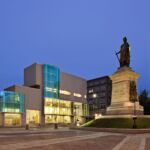
A stunning transformation has taken place at the Portland Public Library in northern New England, turning it from a cold and forbidding structure into a vibrant and modern public resource. The introduction of a new façade and an urban screen, extending beyond the building's edge, symbolizes the library's commitment to bringing its resources and information into the public realm. This project has successfully re-engaged the library within the cultural life of the city, filling a gap that had previously existed.
Previously, the library seemed disconnected from the fabric of the city. Its dark and lifeless front not only reflected its unwelcoming interior but also created a physical barrier between the library and the community. Visitors were greeted by a long and dreary entrance ramp, leading to a service desk and public spaces hidden deep within the building. The children's library was located in the basement, past the public restrooms, which unfortunately attracted transients. Furthermore, tall and tightly spaced stacks obstructed views and created a sense of unease. The library suffered from poor lighting, signage, and organization, all contributing to its negative perception among the public. Outdated technology and inadequate public computing and meeting spaces only added to its shortcomings. Additionally, the lack of a proper staircase made moving between floors a cumbersome task, forcing visitors to rely on fire stairs.
However, this bleak scenario has been completely transformed. Simons Architects, the architectural studio behind the project, has successfully revitalized the library. The new façade and urban screen serve as a beacon, drawing people in and inviting them to explore the library's offerings. By extending beyond the building's edge, it symbolizes the library's commitment to embracing the community and making its resources accessible to all. This project has effectively bridged the gap that once existed, reconnecting the library with the cultural life of the city.
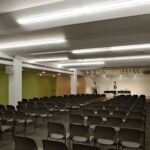
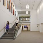
The improvements made to the library go beyond the aesthetic. The once dreary entrance ramp has been replaced with a welcoming and inviting space. The service desk and public areas have been reshaped and relocated, bringing them closer to the library's entrance and creating a more accessible and user-friendly experience. The children's library has been moved to a more prominent location, away from the basement, ensuring that it is a safe and inclusive space for young visitors. The removal of the tall stacks has opened up the library, allowing natural light to flood in and creating a more open and inviting atmosphere. The lighting, signage, and organization have been vastly improved, ensuring that visitors can easily navigate the library and find what they need. Upgraded technology, along with enhanced public computing and meeting spaces, now cater to the needs of the modern library user.
In conclusion, the Portland Public Library has undergone a remarkable transformation, turning it from a disconnected and unwelcoming space into a vibrant and modern public resource. Thanks to the vision and expertise of Simons Architects, the library has successfully re-engaged with the city, filling a gap that once existed. The new façade and urban screen not only symbolize the library's commitment to bringing its resources into the public realm but also serve as a beacon, drawing people in and inspiring them to explore. With its improved design, accessibility, and updated amenities, the library now stands as a true civic presence and an integral part of the cultural life of the city.
Read also about the Paramétrico: A Technological Marvel Redefining Architecture project


