GROCERY STORE by Messner Architects - Innovative Design
Project's Summary
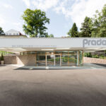
GROCERY STORE represents a significant advancement in modern architectural design, crafted by the esteemed Messner Architects. The project is ingeniously situated on a gentle slope, integrating seamlessly with the surrounding topography and existing infrastructure. The emphasis on site-specific morphological aspects not only enhances the aesthetic appeal but also optimizes the functional requirements essential for a grocery store, creating a harmonious relationship between the built environment and nature.
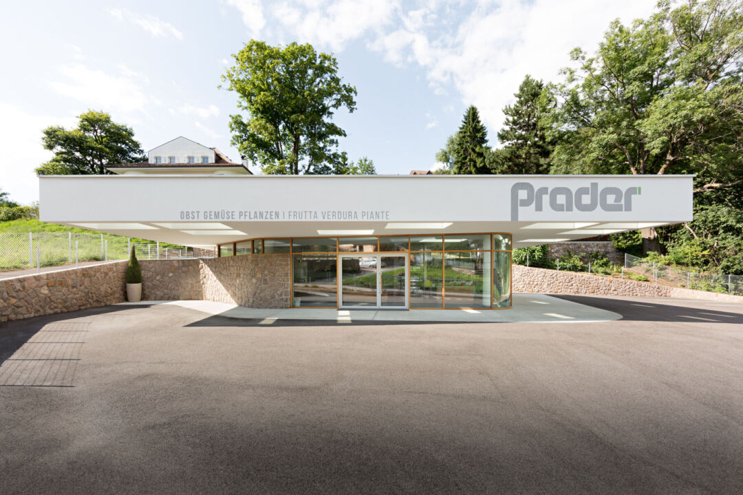
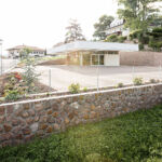
The site itself is enveloped by undulating meadows that slope eastward, bordered by a wooded hill and a bypass road, which collectively shape the unique character of the area. This picturesque setting is complemented by the presence of summer mansions, flourishing gardens, and traditional stone walls, each contributing to the overall charm of the environment. The architectural design takes full advantage of these natural elements, ensuring that the grocery store is not just a building but a part of the landscape.
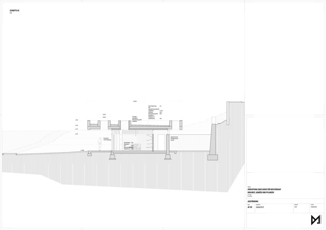
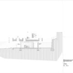
A prominent feature of the project is the retaining wall that ascends from the west and descends to the east, effectively enclosing the site and creating a defined boundary. The access point to the store is strategically located along the main street, facilitating a direct route to the parking area. Additionally, a cleverly designed rear gap between the building and the retaining wall serves as a discreet space for the supply of goods, showcasing the thoughtful planning that went into the project's logistics.
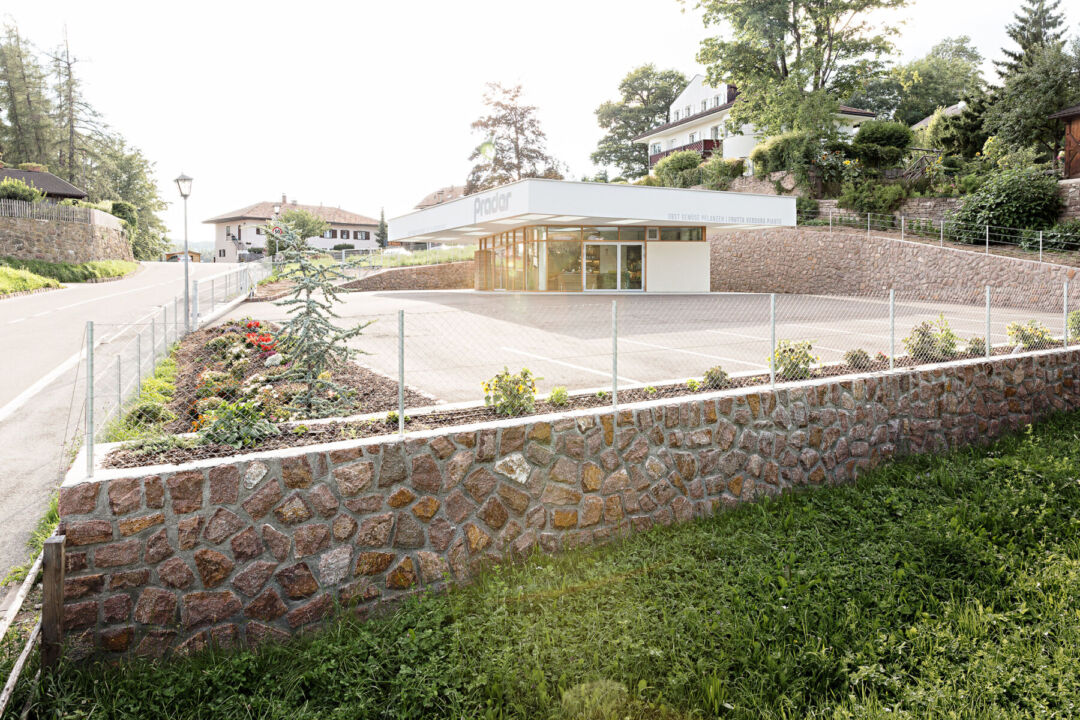
The grocery store comprises a spacious sales area dedicated to fresh produce and a flower shop, along with essential administrative spaces that include stockrooms, offices, a bathroom, and a heating room. The layout of the building is such that the administrative areas are positioned to the north, providing structural integrity, while the sales room enjoys a southern exposure, enhancing visibility and accessibility for customers. This strategic orientation is vital for maximizing foot traffic and creating an inviting shopping experience.
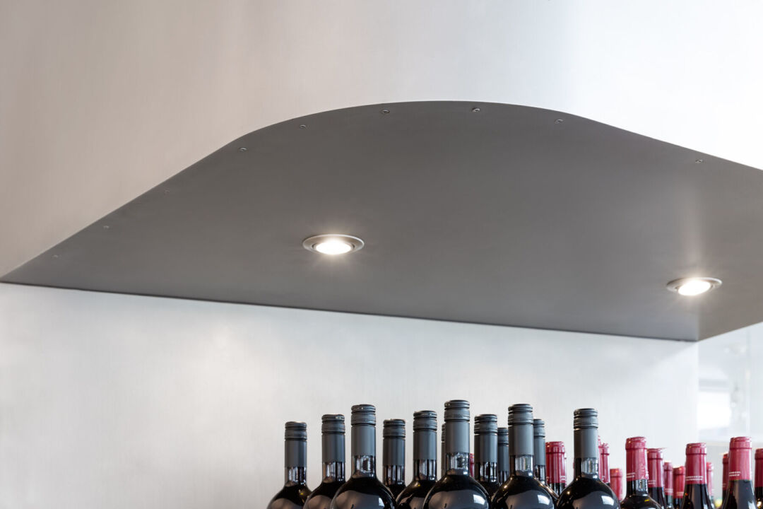
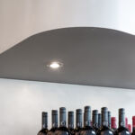
The architectural design features a robust roof that resembles a heavy slab, creating a covered forecourt that fosters market-like interactions. Generously sized cut-outs allow natural light to filter through the flat roof, giving the impression that it is almost floating above the space. Supported by three pillars and two cores, the roof's construction is distinct from the facade, which flows gracefully into the landscape. The use of materials such as stainless steel for the shelves and rough-sawn larch wood for the counter adds a touch of warmth and sophistication, while the overall design blurs the boundaries between the exterior and interior, inviting customers to engage with the space in a unique way.
Read also about the Renk Mobil: A Vibrant Architectural Marvel project
